Interactive Design - Task 1: Exercise 1
22/4/2025 - 5/5/2025 / Week 1 - Week 3
ChenYuhan / 0378131
Interactive Design/ Bachelor of Design (Honours) in Creative Media / Taylors University
Task 1: Exercise 1
ChenYuhan / 0378131
Interactive Design/ Bachelor of Design (Honours) in Creative Media / Taylors University
Task 1: Exercise 1
TABLE OF CONTENTS
INSTRUCTIONS
<iframe src="https://drive.google.com/file/d/1ZboslTwWd0VcBq-AuI1L_iQSMfel1WbL/preview" width="640" height="480" allow="autoplay"></iframe>
LECTURES
Principle of Usability
1.Consistency
Consistency ensures that your website looks coherent and works harmoniously across all its different elements, such as headers, footers, sidebars and navigation bars.
2.Simplicity
Simplicity is used loosely to refer to the need to minimize the number of steps involved in a process, to use symbols and terminology that make the interface as obvious as possible, and to make it difficult to make mistakes.
3.Visibility
Visibility is the basic principle that the more visible an element is, the more likely users will know about them and how to use them. Equally important is the opposite: when something is out of sight, it’s difficult to know about and use.
4.Feedback
Feedback communicates the results of any interaction, making it both visible and understandable. Its job is to give the user a signal that they (or the product) have succeeded or failed at performing a task.
5.Error Prevention
It involves alerting a user when they’re making an error, with the intention to make it easy for them to do whatever it is they are doing without making a mistake. The main reason this principle of error prevention is important is that we humans are prone to- and will always make mistakes.
TASK 1:EXERCISE 1
Exercise 1:Web Analysis
Task Instruction:
Select five 5 websites from the links provided. Identify the strengths and weaknesses of the websites in terms of their design, layout, content, and functionality, and think about how they affect the user experience.
Chosen Websites:
https://111w57.com/Web Analysis Report on 111 West 57th Street
 |
| Fig1.1.1 Homepage of 111 West 57th Street,week 1(2025/04/24) |
Purpose and Goals Communication:
The website aims to introduce the amazing central apartment 111W57 in Manhattan, and attract elite wealthy people to invest and purchase by explaining its location, excellent services, design concepts, etc.
Visual Design and Layout:
 |
| Fig1.1.2 About the Landscape Introduction Page,week 1(2025/04/24) |
The most common use of this website is full-screen pictures + huge font introduction.
This design is very grand and matches the "luxury" of the apartment. At the same time, the background page color is beige, which is simple yet elegant, and the soft tones are conducive to reading.
 |
| Fig1.1.3 Last page introduction,week 1(2025/04/24) |
On the last page, the webpage places a more detailed exploration category. The four parallel options form an orderly composition and achieve a soft harmony in the colors of the selected photos.
Functionality and Usability:
 |
| Fig1.1.4,Workbench,week 1(2025/04/24) |
The functionality of this website is simple but comprehensive. Through a brief introduction to the apartment, a jump button (such as design-) is attached after each photo. The jumps are summarized on the last page, making it more convenient and quick to learn about the specific items. And "Contact Us" is always in the upper right corner, indicating that the website is very happy for customers to come to the door for inquiries.
Content Quality and Relevance:
 |
| Fig1.1.5,Display on mobile phone screen,week 1(2025/04/24) |
The website can also be used and viewed normally on mobile devices (represented by mobile phones). The horizontal screen images displayed on the computer side have been changed to vertical versions, which is more convenient for scrolling and reading on mobile screens. Most of the text has also been changed to vertical versions. Similar to the original version, when the last page is subdivided, the pictures are selected by sliding horizontally.
Web Analysis Report on Rosehip:
 |
| Fig1.2.1,Homepage of Rosehip,week 1(2025/04/24) |
Purpose and Goals Communication:
Rosehip - "A forward-thinking, multi-strategy investment firm focused on identifying unique investment opportunities at all stages in the complex world of digital assets."Its purpose and objective is to discover studios/enterprises with potential and worthy of investment to achieve a win-win situation.
Visual Design and Layout:
The entire webpage uses a bold contrast of black and yellow. Black as the background color makes the yellow more vivid. Special effect fonts and standard fonts are used with different font sizes to take into account the primary and secondary and visual hierarchy.
Functionality and Usability:
After entering the selection page through the homepage, you can see that the interface is divided into two parts. The left side is the representative pattern of the project (which can light up or change direction as the mouse moves), and the right side is the project name, which can be changed by sliding the mouse up and down. Each project has a different icon, which is intuitive and full of technology.
Content Quality and Relevance:
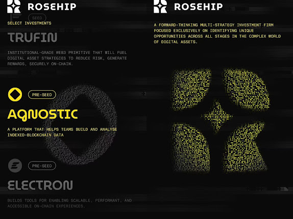
 |
| Fig1.2.3,Display on mobile phone screen,week 1(2025/04/24) |
On the mobile side, the most important change is that the icons on the right side of the computer side have become the background, leaving the most critical text part for easy reading and selection. This is a design that is very suitable for mobile terminals.
Web Analysis Report on Letter:
 |
| Fig1.3.1,Homepage of Letter,week 1(2025/04/24) |
Purpose and Goals Communication:
Letter is an emerging bank that designs elegant and beautiful bank cards for high net worth individuals.
Visual Design and Layout:
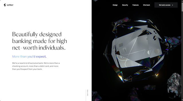
 |
| Fig1.3.2,Bank card advantages,week 1(2025/04/24) |
The most important design element of this webpage is "diamond". Therefore, most of the background is pure white, and important fonts are expressed in color (the light reflected by the diamond). Therefore, the black background appears under the large area of pure white, creating a strong visual impact.
Functionality and Usability:
This website is a simple introduction to the bank card, and there is no link in the introduction. The only link is in the "Pre-view" in the upper right corner. This allows users to focus on the attractiveness of the card itself. Every time the page is scrolled down, the diamond moves or splits, which increases the aesthetics.
Content Quality and Relevance:
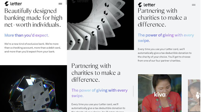
 |
| Fig1.3.3,Display on mobile phone screen,week 1(2025/04/24) |
On the mobile side, it retains the core "diamond animation on the scrolling interface" and adjusts the text and pictures to fit the mobile screen size. The difference is that on the mobile side, the section about "charitable donations" has many more photos. The website runs smoothly and there is no lag due to the animation.
Web Analysis Report on ASARO:
 |
| Fig1.4.1,Homepage of ASARO,week 1(2025/04/24) |
Purpose and Goals Communication:
 |
| Fig1.4.2,Website Purpose,week 1(2025/04/24) |
Asaro creates extraordinary experiences for guests travelling on luxury yachts around the globe. We work with captains and crew of superyachts and mega yachts – together with owners’ representatives, yacht brokers and estate managers – to deliver entertainment on a previously unimagined scale.
Visual Design and Layout:
The website mainly uses a dark blue background to simulate the ocean, which is in line with the characteristics of a cruise ship. The same serif font is used in different font sizes to highlight the primary and secondary. A large number of pictures and decorations related to pirate elements (such as pirate hats, pocket watches, skulls, etc.) strengthen the excitement of the cruise ship, which is in line with the theme of "adventure".
Functionality and Usability:
The interface needs to be unlocked by sliding as shown in Fig1.4.3, which increases the sense of exploration. The entire website is not complicated, it just introduces the cruise project and the reasons for selecting the team. However, through many clever ideas, such as increasing the depth of page exploration (slide to unlock the content page, the content page needs to click to turn the page, and discover is required to learn more), these make the webpage complex and exploratory. At the same time, the website has not forgotten that it needs to find customers, so it always puts "Contact Us" in the upper right corner.
Content Quality and Relevance:
 |
| Fig1.4.5,Display on mobile phone screen,week 1(2025/04/24) |
The design of this webpage on the mobile phone is smoother and more intuitive. It saves a lot of "unlock" functions and introduces them in a more direct jump. In general, both the mobile and computer versions have their own advantages and disadvantages, but both are good design works.
Web Analysis Report on Curaffy:
 |
| Fig1.5.1,Homepage of Curaffy,week 1(2025/04/24) |
Purpose and Goals Communication:
This is a showcase page for AI-created images, which aims to display exquisite AI-produced images and ultimately promote AI creation tools.
Visual Design and Layout:
The website uses three colors, black, white and gray, to show the hierarchy with different shades of colors. Large areas are displayed with pictures instead of text, and the extremely simple and regular page and layout design are easy to read.
Functionality and Usability:
 |
| Fig1.5.2,Image introduction page,week 1(2025/04/24) |
The website design is very simple. Scroll and select the picture to get a brief introduction of the picture. When you put the mouse over the picture, a ripple effect will appear.
Content Quality and Relevance:
 |
| Fig1.5.3,Display on mobile phone screen,week 1(2025/04/24) |
On the mobile side, the webpage almost completely replicates the simplicity and all functions of the desktop side. This makes it very fast to browse, and the webpage has no lag or delay.
FEEDBACK
week 1:
In the first week, the professor introduced us to the semester's learning guide (MIP).
week 2:
Through the five principles, we understand and learn the basic rules of the website, and put the principles into practice by analyzing the selected website.
REFLECTION
Experiences:
By studying the five basic principles of web pages, we analyzed the five selected web pages and compared the advantages and disadvantages of each website in terms of purpose, layout, functionality, applicability and relevance.
Observations:
During the exploration, I found that the same website usually has different presentations on different devices (such as computers and mobile phones), suitable for horizontal and vertical screens respectively, making the website accessible to multiple users.
Findings:
The design of the website needs to be closely connected with the theme, because the ultimate purpose of the website is to promote something or get funding, so it is very important to have an innovative design that users can remember and choose.


Comments
Post a Comment