Advanced Typography - Task 1: Exercises
21/4/2025 - 21/5/2025 / Week 1 - Week 4
ChenYuhan / 0378131
Advanced Typography/ Bachelor of Design (Honours) in Creative Media / Taylors University
Task 1: Exercises
ChenYuhan / 0378131
Advanced Typography/ Bachelor of Design (Honours) in Creative Media / Taylors University
Task 1: Exercises
TABLE OF CONTENTS
INSTRUCTIONS
<iframe src="https://drive.google.com/file/d/1ZypRpBbYoVi8mU3koXKKYM_P1gDzb0j0/preview" width="640" height="480" allow="autoplay"></iframe>
LECTURES
week 1:
Typographic Systems
 |
| Fig1.1.1,Eight Typographic Systems,week 1(2024/04/27) |
1.Axial:
All elements are organised to the left or right of a single axis. The axial can be bent and uses more than a single line.
2.Radial:
All elements are extended from a point of focus. It can have multiple points of focus.
3.Dilatational:
All elements expand from a central point in a circular fashion. You can have multiple rings and place the elements based on the reading rhythm or hierarchy.
4.Random:
Elements appear to have no specific pattern or relationship.
5.Grid:
A system of vertical and horizontal divisions.
6.Modular:
An informal system of layered banding. A series ofnon-objective elements that areconstructed in as a standardisedunits.
7.Transitional:
A series of non-objective elements that are constructed as a standardised unit. You can shift the order of the elements as long as the units' sizes are the same. The point of this system is that you can move your elements, but they must be in the same grid system, inside the border and the cell.
8.Bilateral:
All text is arranged symmetrically on a single axis.
Many designers focus primarily on the grid system for design and are unaware of the potential that other systems hold. Understanding the other typographic system can break free from the "rigid horizontal and vertical grid systems of letterpress".
week 2:
Typographic Composition
| Fig1.2.1,Typographic Composition,week 2(2025/04/29) |
Principles of design composition:
1.emphasis
2.isolation
3.repetition
4.symmetry and asymmetry
5.alignment
6.perspective.
The rule of thirds:
A photography composition guide that divides an image into a 3x3 grid. The intersecting lines are used to direct attention within a given space.
Environmental Grid:
The system consists of a mix of existing or multiple structures.
Form and Movement:
Placing a form on one page and placing forms on multiple pages creates motion.
week 3:
Context & Creativity
| Fig1.3.1,Different text,week 3(2025/05/07) |
Cuneiformc:
Cuneiform, the earliest systemof actual writing, was used in anumber of lanquages betweenthe 34C.B.C.E. through the 1stcentury C.E. lts distinctivewedge form was the result ofpressing the blunt end of a reedstylus into wet clay tablets.
Hieroglyphics:
The Egyptian writing system isfused with the art of reliefcarving. The system was amixture of both rebus andphonetic characters-the firstlink to a future
alphabetic system.
Built on the Egyptian logoconsonantal system, the Phoenicians developed a phonetic alphabet consisting of 22 letters.They are read from right to left.These early Greek letters were drawn freehand, not constructed with compassesand rule, and they had no serifs.
Roman Uncials:
By the 4th century Roman letters were becoming more rounded, the curved form allowed for less strokes and could be written faster.
English Half Uncials:
In England the uncial evolved into a more slanted and condensed form. While English and lrish uncials evolved, writing on the European continent devolved considerably and needed are former.
Carolingian minuscule:
During Charlemagne'spatronage book production increased and language was standardized-pronunciation and spelling as well as writing conventions-capitals at the start of a sentence, spaces between words and punctuation.
Black Letter:
Blackletter is characterized by tight spacing and condensed lettering. Evenly spaced verticals dominated the letterform.
The ltalian Renaissance:
Humanistscholars in ltaly were slowly reviving the culture of antiquity.The renaissance embrace of ancient Greek and Roman culture spurred a creative wave through ltalian art,architecture,literature and letter form design.Humanist named the newly rediscovered letterforms Antica.The renaissance analysis of form that was being applied to art and architecture was directed toward letterform-resulting in a more perfect or rationalized letter.
 |
| Fig1.3.2,The Evolution of Writing in Eastern Civilizations,week 3(2025/05/07) |
Middle Eastern Alphabets:
It is also important to notethat while the Phoenician letter marks a turning point in written language-use of sound represented in letters_the script itself has been possibly influenced by the Egyptian Hieroglyphics and Hieratic Scripts.
Indus Valley Civilization:
The oldest script found in the Indian subcontinent is the hieroglyphics of the Indus Valley Civilization, which has not yet been deciphered and appears to be of a symbolic-syllabic nature. "Some consider these symbols to be non-linguistic, while others consider them to be linguistic."
Brahmi script:
It is the earliest writing system developed in India after the Indus script. lt is one of the mostinfluential writing systems; all modern Indian scripts and several hundred scripts found in Southeast and East Asia are derived from Brahmi.
Chinese script:
From the Oracle boneto Seal Script to Clerical Script, Traditional and Simplified scripts.
week 4:
Designing Type
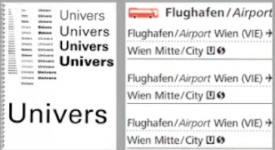 |
| Fig1.4.1,Frutiger,week 4(2025/05/15) |
Frutiger is a sansserif typeface designed by the Swiss type designer Adrian Frutiger in 1968 specifically for the newly built Charles de Gaulle International Airport in France.
The goal of this new typeface was create a clean,distinctive and legible typeface that is easy to see from both close upand far away. Extremely functional.
"...He tested with unfocused letters to see which letterforms could still be identified."
 |
| Fig1.4.2,Verdana(1996),week 4(2025/05/15) |
Many of Carter's fonts were created to address specific technicalchallenges, for example those posed by early computers.
The font was tuned to be extremely legible even at very smallsizes on the screen due in part to the popularity of the internet and electronic devices.
 |
| Fig1.4.3,Johnston Sans(1916),week 4(2025/05/15) |
A typeface with "bold simplicity" that was trulymodern yet rooted in tradition.
It handed over details and examples of letter shapes that would set the tone forprinted text until the present day.
Johnston applied the proportions of Roman capital letters to his typeface, so it was rooted in history, rooted intraditional calligraphy. But it has an elegance and a simplicity that absolutely fitted the modern age.
General Process of Type Design:
1.Research
When creating type, we should understand type history, type anatomyand type conventions. We should also know terminologies, side-bearing, metrics, hinting..
2.Sketching
Generally, traditional tools (hand-drawing, etc.) and digital tools are used, and both methods have their own advantages and disadvantages.
3. Digitization
There are professional software that are used in the digitization of typefaces, amongst the leading software are: FontLab and GlyphsApp.
4. Testing
The results of the testing is part of the process of refining and correcting aspects of the typeface.
5.Deploy
Even after deploying a completed typeface there are always teething problems that did not come to the fore during the prototyping and testing phases. Thus, the task of revision doesn't end upon deployment.
Many different forms and constructions must be taken into account when designing a new type. An important visual correction is the extrusion of curved (and protruding) forms past the baseline and capline. This also applies to vertical alignment between curved and straight forms.
A visual correction is also needed for the distance between letters. lt is not possible to simply place letters next to each other with equal spacing between them. The letters must be altered to a uniform'visual' white space. This means that the white space between the letters should appear the same. This is called 'fitting' the type.
"Designing a typeface is a labour of love. Only the brave and foolishwalk this path for the reward pale in comparison to the work."
EXERCISE 1:TYPOGRAFHIC SYSTEM
week 1:
The exercise is to design eight layouts using this eight systems.
Title:All Ripped Up: Punk Influences on Design
Content Details:
The Design School,
Taylor’s University
Open Public Lectures:
June 24, 2021
Lew Pik Svonn, 9AM-10AM
Ezrena Mohd, 10AM-11AM
Suzy Sulaiman, 11AM-12PM
June 25, 2021
Lim Whay Yin, 9AM-10AM
Fahmi Reza, 10AM-11AM
Manish Acharia, 11AM-12PM
Lecture Theatre 12
 |
| Fig2.1.1,sketches,week 1(2025/04/27) |
 |
| Fig2.2.1,Axial,week 1(2025/04/28) Fig2.2.2,Radial,week 1(2025/04/28) |
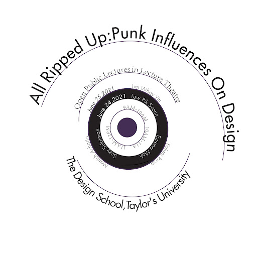 |
| Fig2.2.3,dilatational,week 1(2025/04/28) |
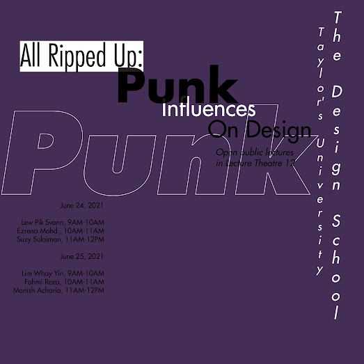 |
| Fig2.2.4,Random,week 1(2025/04/28) |
 |
| Fig2.2.5,Grid,week 1(2025/04/28) |
 |
| Fig2.2.6,Modular,week 1(2025/04/28) |
 |
| Fig2.2.7,Transitional,week 1(2025/04/28) |
 |
| Fig2.2.8,Bilateral,week 1(2025/04/28) |
week 2:
Based on Mr. Vinod's explanation and corrections, I revised my work from week 1 this week.
 |
| Fig2.3.1,Axial,week 2(2025/05/01) |
 |
| Fig2.3.2,Radial,week 2(2025/05/01) |
 |
| Fig2.3.3,dilatational,week 2(2025/05/01) |
 |
| Fig2.3.4,Random,week 2(2025/05/01) |
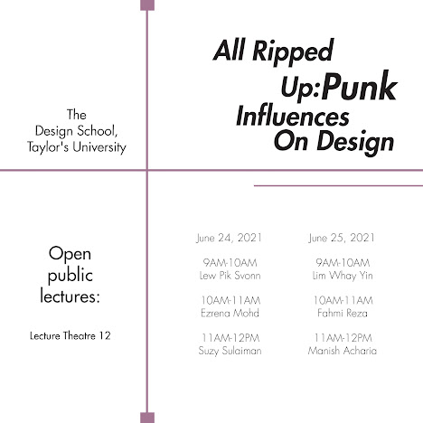 |
| Fig2.3.5,Grid,week 2(2025/05/01) |
 |
| Fig2.3.6,Modular,week 2(2025/05/01) |
 |
| Fig2.3.7,Transitional,week 2(2025/05/01) |
The flow direction of the original image has been modified, and a sense of interlacing has been created through two different flow directions, making the picture more beautiful.
 |
| Fig2.3.8,Bilateral,week 2(2025/05/01) |
The text has been slightly adjusted to be more neat.
Final Outcome
 |
| Fig2.4.1,Final Axial,week 2(2025/05/01) |
 |
| Fig2.4.2,Final Radial,week 2(2025/05/01) |
 |
| Fig2.4.3,Final dilatational,week 2(2025/05/01) |
 |
| Fig2.4.4,Final Random,week 2(2025/05/01) |
 |
| Fig2.4.5,Final Grid,week 2(2025/05/01) |
 |
| Fig2.4.6,Final Modular,week 2(2025/05/01) |
 |
| Fig2.4.7,Final Transitional,week 2(2025/05/01) |
 |
| Fig2.4.8,Final Bilateral,week 2(2025/05/01) |
Fig2.4.9,Final artwork with baseline grid,week 2(2025/05/02)
<iframe src="https://drive.google.com/file/d/1sRTeKsXcvMZC6TQ3Sb-v4ANGUrjzraMx/preview" width="640" height="480" allow="autoplay"></iframe>
Fig2.4.10,Final artwork,week 2(2025/05/02)
<iframe src="https://drive.google.com/file/d/1sNtqOooGJZ-u0wn1nZxvsBkusyDIUEjE/preview" width="640" height="480" allow="autoplay"></iframe>
EXERCISE 2:POSTER
week 3:
In this exercise, we need to find inspiration pictures from natural life, extract fonts from the pictures for font design and further complete the poster.
Final Submission should consist of:
- Image
- Extracted Letterforms on baseline (illustrator)
- Reference font
- Final letterforms on baseline
- Original extraction and final letterforms next to each other
Because there are a lot of plants where I live, I can see a rich ecology every day. Spiders are the most common insects, and their spider webs are also a must-see item for me every day. So I looked for pictures of spiders and spider webs, and got inspiration from them to extract letters.
 |
| Fig3.1.1,Spider and spider web,week 3(2025/05/05) |
I wanted to make the spider and spider web elements more prominent and recognizable at a glance, so I found some similar reference fonts and modified them.
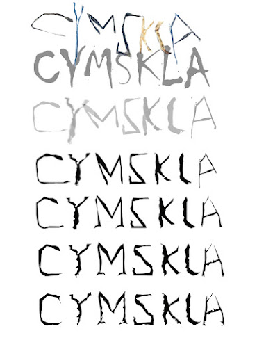 |
| Fig3.1.4,Font evolution,week 3(2025/05/05) |
week 4:
Mr. Vinod gave me some suggestions, such as adding "hollowing" to the font to create a spider web feeling. Influenced by this, I also thought of adding white shadows to simulate the feeling of "joints". At the same time, I will replace some parts that are too abnormal and inconsistent to ensure the systematic nature of the font.
 |
| Fig3.2.1,Font evolution 2,week 4(2025/05/11) |
Because the seven letters extracted cannot directly form a meaningful phrase, I split them into two words, "lacy" and "mask." (Because there is no "e", I deformed "lace.") Because spider silk reminds people of the equally sophisticated lace, they have many things in common, such as the meaning they express in fashion - mysterious and elegant.
In my imagination, the background image should be a black background + a woman wearing a lace mask, accompanied by spiders or spider web elements, full of mystery. But I didn't find such a picture, so I combined these photos on Pinterest and got the background image.
 |
| Fig3.2.5,Background picture making,week 4(2025/05/11) |
 |
| Fig3.2.6,Title typography,week 4(2025/05/11) |
I wanted the titles to be prominent and to bring emphasis, so I placed them in the middle. Each letter was partially connected to create a "cobweb-like" feeling. After determining the position of the title, I designed three layouts of small fonts.
In the end I chose the first version.
 |
| Fig3.2.8,Typesetting 2,week 4(2025/05/11) |
 |
| Fig3.2.9,Typesetting 3,week 4(2025/05/11) |
 |
| Fig3.2.10,Poster 1,week 4(2025/05/11) |
The part of last poster that I was most dissatisfied with was the arrangement of the small words. I tried a variety of composition systems and also made some changes to the color of the title, hoping to make the poster better.
Splitting the title up and down would be a huge distraction, so I put the longer title in a row and added the publisher at the bottom of the poster.
 |
| Fig3.3.2,Typesetting 5,week 4(2025/05/18) |
 |
| Fig3.3.3,Typesetting 6,week 4(2025/05/18) |
In the first two poster attempts, I was not satisfied with the empty space around the first one, and the small words on the top were too cumbersome in the second one. In the last attempt, I combined the advantages of the two posters and tried to correct the shortcomings, making the small words on the top separate and moving the release time to the middle to ensure that the picture would not be too empty.
Final Outcome:
 |
| Fig3.4.1,Image and Extraction,week 4(2025/05/18) |
 |
| Fig3.4.2,Overall Process,week 4(2025/05/18) |
 |
| Fig3.4.3,Extracted letterforms (baseline),week 4(2025/05/18) |
 |
| Fig3.4.4,Reference font,week 4(2025/05/18) |
 |
| Fig3.4.5,Final Letterform,week 4(2025/05/18) |
 |
| Fig3.4.6,Original extraction (top) and final letterform (bottom) comparison, week 4(2025/05/18) |
Fig3.4.7,Exercise 2 Part 1 PDF Compilation,week 4(2025/05/18)
<iframe src="https://drive.google.com/file/d/1zP4-OIU_jyT7yu8kD2wrqxnIBDK9QqR4/preview" width="640" height="480" allow="autoplay"></iframe>
 |
| Fig3.4.8,Finalized Poster,week 4(2025/05/18) |
Fig3.4.9,Finalized Poster (PDF),week 4(2025/05/18)
<iframe src="https://drive.google.com/file/d/1zQezrVJu93ubGPHgIB4w38tASzR4K91J/preview" width="640" height="480" allow="autoplay"></iframe>
FEEDBACK
week 1:
General feedback:
Mr. Vinod explained and sorted out the course guidance (MIP) for this semester.
week 2:
General feedback:
1. Pay attention to color contrast. The color should be easy to read (too dark/too bright is not allowed) 2. Pay attention to white space. Large areas of white space are usually wasteful and inappropriate. 3. The order of information. Distinguish the reading order of information through composition size, color emphasis, etc.
Specific Feedback:
In "Axial", modify the time information distance to make it closer. In "Radial", modify the information extending from the center point. You can add another small center point to supplement the information. In "Dilatational", pay attention to the size and position of the information to be designed according to the importance (inclusion) of the information. In "Random", modify the color brightness to make the text clear. In "Modular", add lines to divide the module area to make it more obvious. In "Transitional", modify the amplitude of the flow to make it more balanced and beautiful.
week 3:
General feedback:
1. When choosing letter-like shapes from images, make sure they are highly similar. Fonts that are too abstract are not easy to modify. 2. Make sure your image is a photo, not a painting. 3. The final font needs to conform to the characteristics of the object in the original image for easy identification.
Specific Feedback:
Because my reference is a spider web, I can hollow out the inside of my font to simulate the feeling of "spider silk" based on the existing one. Modify the too irregular parts to make it as systematic as possible.
week 4:
General feedback:
1. The background of the movie poster you create should be consistent with the font design concept and style. 2. The elements should not be piled up in a messy way, and they should meet the basic requirements of composition.
Specific Feedback:
This poster lacks a publisher, which needs to be added; the small characters are too scattered and need to be rearranged; the title is divided into two parts, which distracts the first attention and needs to be put together again.
FURTHER READING
 |
| Fig4.1.1,A type primer |
1.Describing Letterforms
Explains the parts of letters, such as stems, arms, and serifs.
2.The Font and Typeface
The book distinguishes between a typeface (the design of the letters) and a font (the delivery mechanism of that design). This distinction is crucial for selecting appropriate type for various projects.
3.Measuring Type
Kane introduces units of measurement in typography, like points and picas, and explains how to measure type size and spacing.
4.Comparing Typefaces
The book encourages comparing different typefaces to understand their unique features and appropriate uses.
5.Development and History
Kane provides a brief history of typography, highlighting its evolution from traditional printing methods to digital typesetting.
Reading the first 30 pages of A Type Primer has deepened my appreciation for typography. I learned that every aspect of type—from the shape of letters to the spacing between them—plays a vital role in communication.Many of the concepts mentioned in this book were also mentioned in Mr. Vinod’s lectures, which deepened my understanding of the basics of typography
REFLECTION
Experiences:
In Task 1, we spent half a semester learning font design and digitization in four weeks. This is a good way to consolidate the knowledge learned last semester. At the beginning, we extracted fonts from things in daily life, and after a series of revisions, we made them follow the characteristics of objects and have the beauty of design. Another important task is to design posters that match the fonts through the eight graphic design systems we practiced before. When creating the poster base map, we need to combine the image processing skills we learned in DPI class and IVN class. In short, this is a task that tests comprehensive ability.
Observations:
During this learning process, I found that the most difficult thing is that my work requires countless struggles and revisions. I can't make a satisfactory work in a relatively short time like others. I have to spend more effort and nights. And many of my revisions are invalid, because I find that the revised ones are not as good as the original ones... What I need to learn is how to sum up experience from these tedious and repeated revisions, so that I can be more relaxed later, maybe. But every time I complete the final design, I will finally have a feeling of "it turns out that I have done it too".
Findings:
There are countless possibilities for font design and even graphic design. So please don't deny your own work just because you like the results of others' designs. Everyone has different styles and preferences. For this reason, allow different design ideas to collide, rather than simply thinking that your own "style" is inferior. Absorb applicable design elements or ideas from other people's works and transform them into your own knowledge. The most important thing is, never deny yourself.




Comments
Post a Comment