Typography Task 1: Exercises
23/9/2024-21/10/2024(week1-week5)ChenYuhan (0378131)Typography/Bachelor of Creative Media/Taylors UniversityTask 1: Exercises
LECTURES
week 1: 23/9/2024
Lecture 0:Introduction
In the first class, I met the teacher through a simple self-introduction.
Following the teacher, I understood the basic rules of typography, as well as some basic methods to beautify the typography.
I knew the definition of typography and its use which can help us finish more design and creative art.
Lecture 1:development
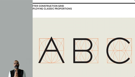
Talk about the development of typography in a mainly western fields of view but still eastern fields of view.
Fig1.2,origin in Rome how the letters evolved
Fig1.3,origin in Rome how the letters evolved
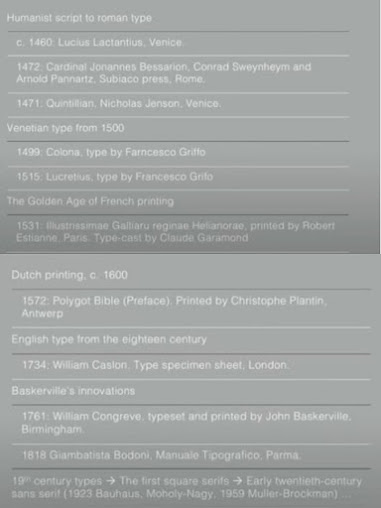
Fig1.4,How kinds of letters changed
Timelines of letters:
In 789,Standard letters capital and lower case
In 1450,Blackletter(the earliest)in Northern Europe
In 1475,Oldstyle in Italy
In 1500,Italic in Europe
In 1550,Script in Europe
In 1750,Translational
In 1775,Modern
In 1825,Square serif
In 1900,Sans serif
Brief summary:
Letters took thousands of years to develop, and the important influencing factors are the progress of human productivity and the need to rule.
week 2:9/30/2024
Lecture 2:Text 1
This lesson mainly shows us the evolution of text.And how to use the Id to change the text.
Fig2.1,A short explanation of the text
We learned the use of some shortcuts,such as
enlarge font:ctrl+shift+>
Remove the grid:ctrl+shift+P
Reduce word spacing:Alt+Left arrow
Increase word spacing:Alt+Right arrow
week 3: 7/10/2024
Lecture 3:Text 2
In this lecture, we learned how to actually manipulate line spacing and paragraph spacing in Indesign.Actually getting to know and using Indesign became a very important point in this lesson. At the same time, we learned some theoretical knowledge that revolves around practical operations, such as how to solve redundant text and how to fine-tune the point size of text.
How to choose between subjective aesthetics and printing needs is also be talked.
Notices:
1.In typography, try not to use left indentation, but to use right indentation, which is for both aesthetic and economic considerations.
2.Avoid the appearance of widows and orphans.(They can be understood as a small part after a large paragraph.)
3.It's best to keep the spacing between words within 3, as exceeding this number can make this line very different from other lines.
4.We usually use italics and bold to highlight texts.
5.Use different heading formats to add layers between texts.
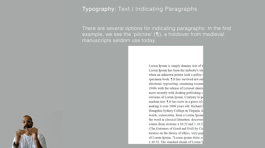
Fig3.1,pilcrow-one isolator
Fig3.2,Cross-alignment with exercise
The key to cross-alignment is to make sure that line spacing(leading) and paragraph spacing are the same.Fig3.3,Widows and orphans/how to solve
Fig3.4,Use different heading formats to add layers between texts
Brief summary:
Typography is a beautiful two-dimensional building, and I couldn't agree more. We learn everything about typography technology, the core is to make it beautiful, convenient, and serve people. The combination of theory and practical practice helped me understand everything about this lesson faster.
week 4:14/10/2024
Lecture 4:Basic
In this lecture we first defined the application of typography in letters and introduced a lot of terms related to different letter forms.We also discussed different typographic styles for uppercase and lowercase.
Fig4.1,Basic typographical definition of letters
Median:The imaginary line defining the x-height of letterforms.
X-height:The height in any typeface of the lowercase 'x'.
Stroke: Any line that defines the basic letterform.
Apex / Vertex:The point created by joining two diagonal stems (apex above and vertex below).
Arm:Short strokes off the stem of the letterform, either horizontal (E, F, L) or inclined upward (K, Y).
Ascender:The portion of the stem of a lowercase letterform that projects above the median.
Barb:The half-serif finish on some curved stroke.
Bowl :The rounded form that describes a counter. The bowl may be either open or closed.
Bracket:The transition between the serif and the stem.
Cross Bar:The horizontal stroke in a letterform that joins two stems together.
Cross Stroke:The horizontal stroke in a letterform that joins two stems together.
Crotch:The interior space where two strokes meet.
Ear:The stroke extending out from the main stem or body of the letterform.
Em/en:Originally refering to the width of an uppercase M, and em is now the distance equal to the size of the typeface (an em in 48 points, for example). An en is half the size of an em. Most often used to describe em/en spaces and em/en dashes.
Ligature:The character formed by the combination of two or more letterforms.
Link:The stroke that connects the bowl and the loop of a lowercase G.
Serif:The right-angled or oblique foot at the end of the stroke.
Shoulder:The curved stroke that is not part of a bowl.
Spine:The curved stem of the S.
Spur:The extension the articulates the junction of the curved and rectilinear stroke.
Stem:The significant vertical or oblique stroke.
Stress:The orientation of the letterform, indicated by the thin stroke in round forms.
Swash:The flourish that extends the stroke of the letterform.
Tail:The curved diagonal stroke at the finish of certain letterforms.
Terminal:The self-contained finish of a stroke without a serif. This is something of a catch-all term. Terminals may be flat ('T' above), flared, acute, ('t' above),
grave,concave, convex, or rounded as a ball or a teardrop (see finial).
week 5:21/10/2024
Lecture 5:Understanding
In this class, we learned about the differences between letters in different fonts. Many spacings and formats make up different fonts, and the differences between fonts may cause different letters of the same size to be not on the same horizontal line, thus affecting the aesthetics of the layout.
We need to better understand and deconstruct the differences between fonts to create more attractive layout designs.
Fig5.1,Stems and leaves between different fonts
Fig5.2,Rules for designing different fonts
The simple contrasts produces numerous variations:
small+organic/large+machined; small+dark/ large light ...
INSTRUCTIONS
<iframe src="https://drive.google.com/file/d/13K1bGUQCjDVO9EjG_HnTEVAY7xbMRGxx/preview" width="640" height="480" allow="autoplay"></iframe>
TASK 1 / Exercise 1 – Type Expression
week 1:
Compose and express the 4 words of your choosing using any of the 10 typefaces provided.
We tried to creative six sketches about pull,explode,wind,chop,rush and tangle.
Fig6.1,sketches
Fig6.2,sketches(2)
Explaining:
Pull:I had the pull gather in the top left corner of the frame to try to create the feeling that it was being pushed by someone. I think the downside is that I haven't been able to find a way to twist it properly, which makes it look stiff.
Chop:Because chop is a very graphic word, I immediately thought of adding "scratches" to it. The black background is to give it the feeling of a tree standing upright.But maybe the scratch is just too small. I'll probably try to modify it later.
Explode:In the word explode, I reoriented the e so that it looks like an exploding base, and the x symbolizes the moment of the explosion. The Plode acts as the two wings of the explosion, extending infinitely to the end of the picture.
Rush:I added a shadow after the word rush and made a gradient effect to try to show an effect that was fast enough to leave an afterimage.
Wind:It's a soft wind, so I tend to be smooth and feminine in the choice of fonts. And because the wind is in any direction, I also created a completely different, mirrored wind. The irregular text design makes the wind flow stronger.
Tangle:A very confusing word, tangle. I tend to separate the word, creating a confused, tangled state of confrontation.
week 2:
We try to be consistent on the template because it makes the whole layout look more beautiful and tidy.
I chose the four designs that I was more satisfied with and waited for the professor's evaluation.
Fig6.3,Finished Product
Explaining:
Chop:Because chop is a very graphic word, I immediately thought of adding "scratches" to it. The black background is to give it the feeling of a tree standing upright.But maybe the scratch is just too small. I'll probably try to modify it later.
Explode:In the word explode, I reoriented the e so that it looks like an exploding base, and the x symbolizes the moment of the explosion. The Plode acts as the two wings of the explosion, extending infinitely to the end of the picture.
Wind:It's a soft wind, so I tend to be smooth and feminine in the choice of fonts. And because the wind is in any direction, I also created a completely different, mirrored wind. The irregular text design makes the wind flow stronger.
week 3:
After Mr. Vinod's comments and suggestions, I reworked the previous design.
Fig6.4,Finished Product(2)
Pull:I redesigned pull, and this time it's obvious that p is pushing the whole word. At the same time, each letter becomes more compact with each other, and there is a sense of being pushed together.
Chop:I did away with the black background of the chop, but still kept its vertical structure. Also, I've bolded the font to make it look more eye-catching. On it, I added many traces of felling, and even some of the polygonal marks. I changed the font of the p to make it look like a lumbersaw, or a knife.
Explode:In the word explode, I reoriented the e so that it looks like an exploding base, and the x symbolizes the moment of the explosion. The Plode acts as the two wings of the explosion, extending infinitely to the end of the picture. There are a lot of floating plodes in the picture.I think it's a very graphic design.
Wind:It's a soft wind, so I tend to be smooth and feminine in the choice of fonts. And because the wind is in any direction, I also created a completely different, mirrored wind. The irregular text design makes the wind flow stronger.
Fig6.5,pull design
Fig6.6,Let pull move!!!
week 4:
FINAL Type Expression
With Mr.Vinod's advice and comments, I modified the shapes of the traces that were a bit complicated before chop and unified their directions.
Fig7.1, Final Type Expressions
Fig7.2, Final Type Expressions
FINAL Animated Type Expression
Fig 8.1,Final Animated Type Expression
TASK 1 / Exercise 2 – Text Formatting
week 5:
We are doing the typesetting design on InDesign, which is a very challenging and interesting exercise. We need to use 10 fonts to complete our typesetting design.
We also practiced typesetting and learned how to adjust letter spacing, line spacing, paragraph spacing, etc.In order to avoid the taboo of "widows and orphans" in typesetting, I studied and practiced a lot in this area.
Fig9.1,Ten fonts
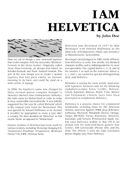
Fig9.2,Typesetting Exercise
FINAL Text Formatting Layout
Fig9.3,Final Text Formatting Layout
Fig9.4,Final Text Formatting Layout
<iframe src="https://drive.google.com/file/d/10CAAkwPoPt70fk9GbMACRpjVzFCXC_7W/preview" width="640" height="480" allow="autoplay"></iframe>
Head Line
Typeface:ITC Garamond Std
Font/s:ITC Garamond Std
Type Size/s:60pt
Leading: 36 pt
Paragraph spacing:0
Body
Typeface:ITC Garamond Std
Font/s:ITC Garamond Std
Type size/s:12pt
Leading:14pt
Paragraph spacing:14pt
Characters per-line:52
Alignment:Left justified
Margins:127mm top 26mmleft+right+bottom
Columns:4
Gutter:10mm
FEEDBACK
week 1:
special feedback:-
general feedback:The sketch annotation should be concise and intuitive.All design is allowed.
week 2:
special feedback:The sketches completed in the last week received feedback accordingly.I think the pull can be more dynamic and increase the intuitiveness of the action.Explode can add some graphics to make it more impact.Tangle may need some more confusing expression, and the current sketches are too neat.
general feedback:More creativity is needed. Don't keep the sketch idea limited to a few points. Choosing fonts is also an important way to express a sketch, and I still need to learn to have everything about it.
week 3:
special feedback:Wind is interesting,I try to make it have one feeling of different directions.But I need to clear it more.Explode is great,professor advised me to add more "plode" so it could be fun.Anyway,chop and pull need more clear performance,maybe I will lead them to be a new type of my designs.For example I will not just try to let them be similar with the meaning of themselves.Some shapes are needed.
general feedback:We can add lots of new tricks to the font.Like drawing something on it or making some shadows.
week 4:
special feedback:Using p push ull is a great idea. But Vinod sir suggested that I make them more dynamic, which can make the whole design more creative. Chop can not use more shapes, because it will make the picture look messy, I will modify this in the work.The design of the animated image is not new, and it needs to make the direction and conditions of force more clear. I also made some changes.
special feedback:Using p push ull is a great idea. But Vinod sir suggested that I make them more dynamic, which can make the whole design more creative. Chop can not use more shapes, because it will make the picture look messy, I will modify this in the work.The design of the animated image is not new, and it needs to make the direction and conditions of force more clear. I also made some changes.
general feedback:When making an animation, you must be clear about what point you want to express, and then make an overall design based on the performance of the action.
week 5:
special feedback:Mr.Vinod gave me some advice that I can change the size of the title,because it was so small and so close to the main text.So,I would change this point by moving it to the left or amplify it.
general feedback:In the layout design,the white space is really important.Leave some space next to the title,or in the section of the article,these all are the useful ways to achieve it.
REFLECTION
Experience:During this period of time, I learned a lot about the basics of typesetting. From the most basic how to use software to create text boxes, to how to typeset and edit complete articles, from the history and development of typesetting, to how we should use typesetting technology that keeps pace with the times under the development of contemporary new media, all of which deepened my understanding and interest in typesetting. In the six weeks of lectures and practice, I really stepped into the world of typesetting.
Observations:Each letter has its own little tail - in some special fonts, this is very interesting to me. I like to browse some different fonts and imagine where to use them. Thank you Mr. Vinod for introducing me to this serif font in detail in his lecture.
Findings:The biggest help of learning typesetting for me is that it makes me realize that behind the seemingly ordinary layout design is the hard work of one or countless typesetting designers, because typesetting is really a tedious but important job. Only those who have tried it can understand the hardship of this job, but it really brings me enough feeling.
FURTHER READING
Fig10.1,Typographic Systems
week 1:
p1-p20
The book begins with a definition of typography, emphasizing that typography is not only the arrangement of words, but also involves factors such as hierarchy, readability, and visual conflict. The author also introduces eight main structural frameworks for typography, including grid, random, modular, and radial. Finally, the book explains the principles of design, the importance of visual hierarchy, and how to create clear visual paths through contrast and alignment to guide readers' attention.
week 2:
p20-p40
The author introduces the random typesetting system, modular system, and radial system.
The random typesetting system creates a unique visual effect by breaking the traditional typesetting rules.
Modular typesetting structures the design, which helps maintain consistency and readability.
Radial typesetting emphasizes how to guide the line of sight through a layout that expands outward from the center. It is often used in situations where a core theme needs to be emphasized.
In addition, contrast and hierarchy are introduced, and corresponding examples are given to help me understand.
week 3:
p40-p60
This section first introduces the bilateral typesetting system, which emphasizes symmetry and visual balance. This system can effectively guide the reader's eyes.
It emphasizes the importance of readability in typesetting, including the settings of letter spacing, line spacing, and paragraph spacing. The author continues to show the application of various typesetting systems through examples, helping me understand how theory can be applied in practice.
week 4:
p60-p80
This section first discusses the use of visual grids, emphasizing how they can make elements consistent in organizing information. Then the author introduces two methods, emphasis and contrast, to enhance visual appeal and make key information stand out. Finally, rhythm and fluidity are discussed. Through specific examples, I understand that good rhythm can make readers feel physically and mentally happy.
week 5:
p80-p100
The author introduces strategies for non-traditional layouts, encourages breaking the rules, explores how to direct the audience's attention through the arrangement and contrast of elements, emphasizes the emotions conveyed by different colors, and how to use color to enhance the communication of design.


final.jpg)


Comments
Post a Comment